
01_iwannapay_mobile_web

This portfolio showcases a payment interface redesign journey. It starts with the goals ("Prologue", "The Brief"), then dives into the design process ("Approaching the Brief", "Implementation"), and concludes with adapting to challenges ("Re-Approaching the Brief").
Prologue
The complex payment interface, known to drive users away, needed a usability overhaul within a two-week sprint. Although successful user testing showed faster payment decisions with our design, resource limitations led to a simpler, untested alternative for final implementation. This outcome highlights the balancing act between design effectiveness and feasibility under tight constraints.
The Brief
Our mission is to redesign the payment method interface for improved simplicity and usability. The current interface, deemed confusing and visually unappealing, leads many users to abandon the payment process. We must showcase all available payment methods clearly while achieving a clean and user-friendly design.
Approaching the Brief
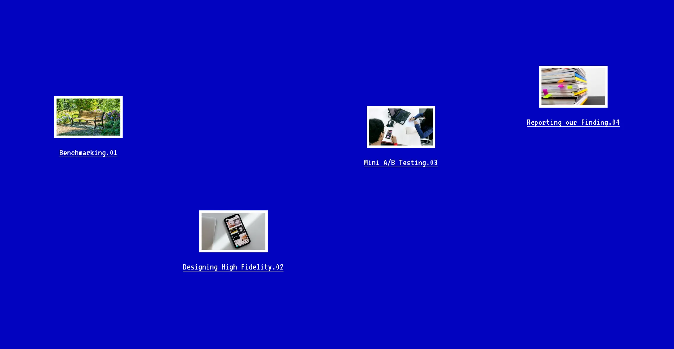
To meet the project's two-week timeframe, we will focus on high-fidelity design, supported by quick but effective benchmarking and mini A/B testing to validate our decisions. Our approach includes thorough research to ensure the design meets expectations and delivers optimal results. We will conclude with detailed reporting of our findings, ensuring transparency and accountability in our process.
Benchmarking
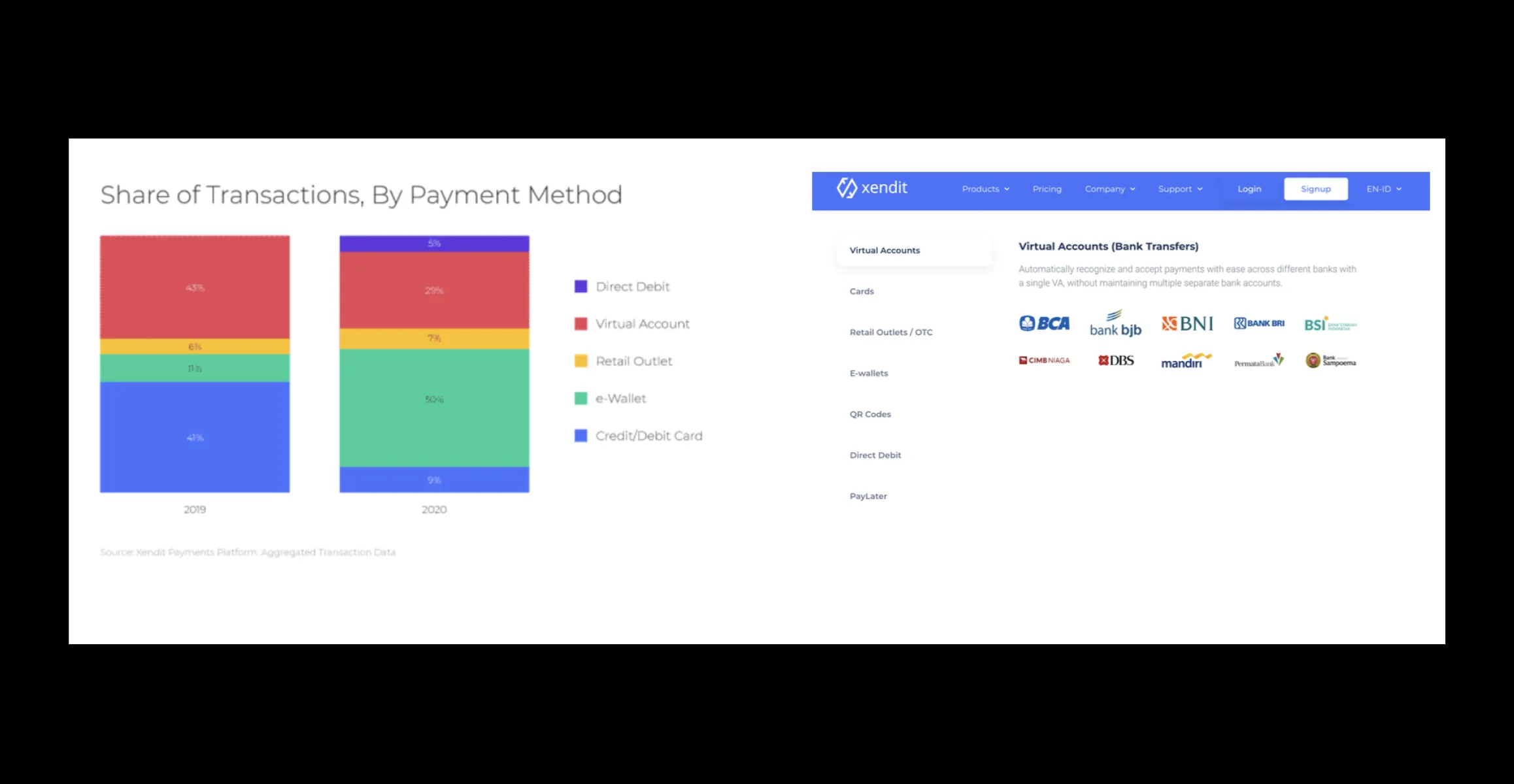
We start benchmarking and exploring a few e-commerce and digital courses platform, to understand what sort of patterns exist out there and how can we adapt them to our payment method.
Understanding Patterns
We start benchmarking and exploring a few e-commerce and digital courses platform, to understand what sort of patterns exist out there and how can we adapt them to our payment method.
Requirement Gathering
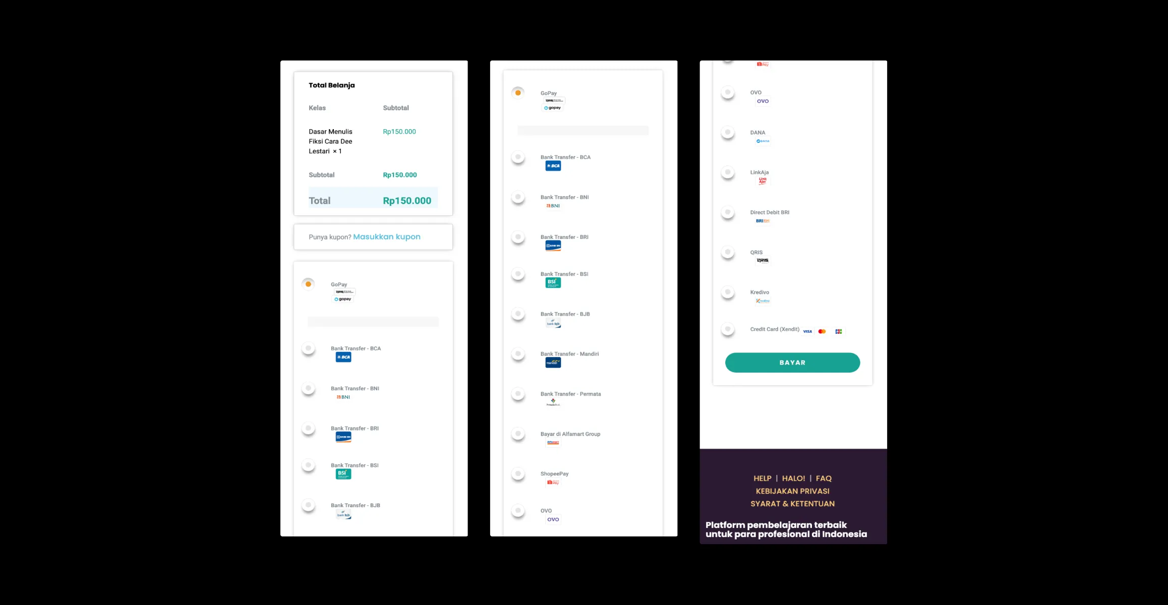
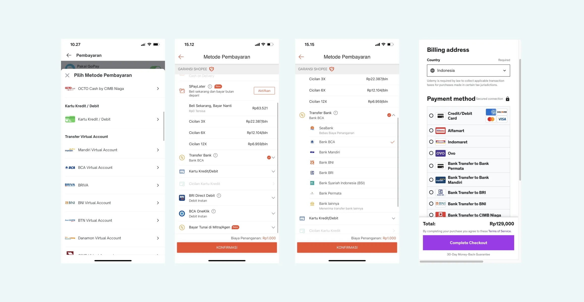
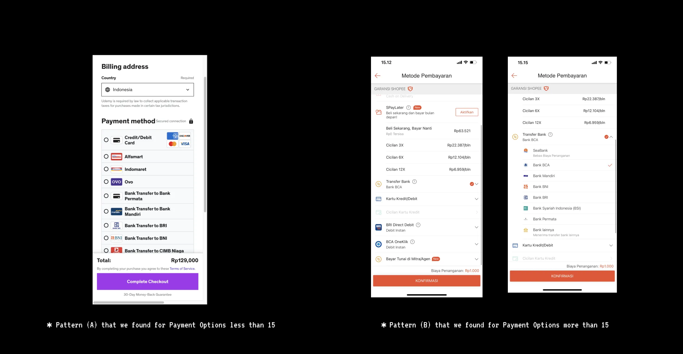
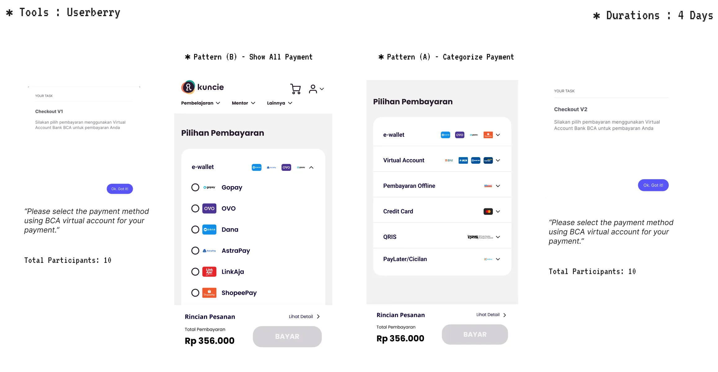
We will adopt the payment method list from Xendit for our system, which includes more than 15 payment methods. It's important to ensure that the payment methods are arranged as per the data provided by Xendit.
Designing High Fidelity
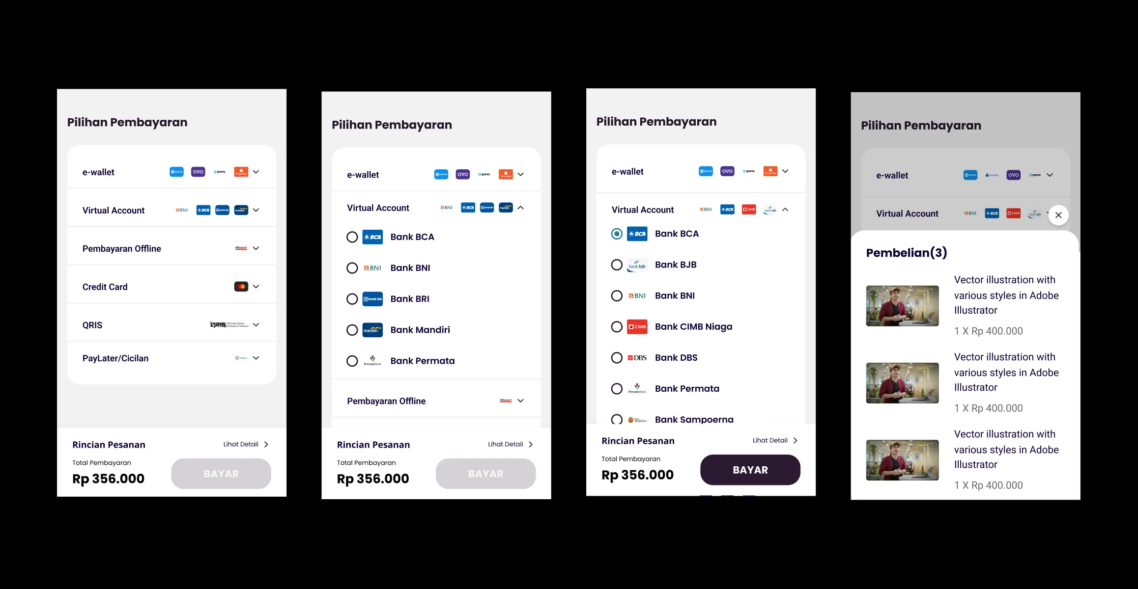
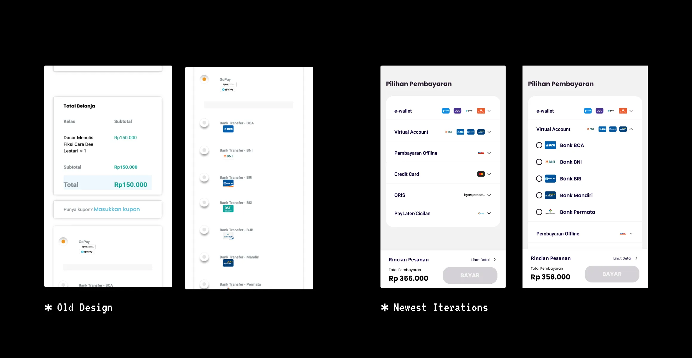
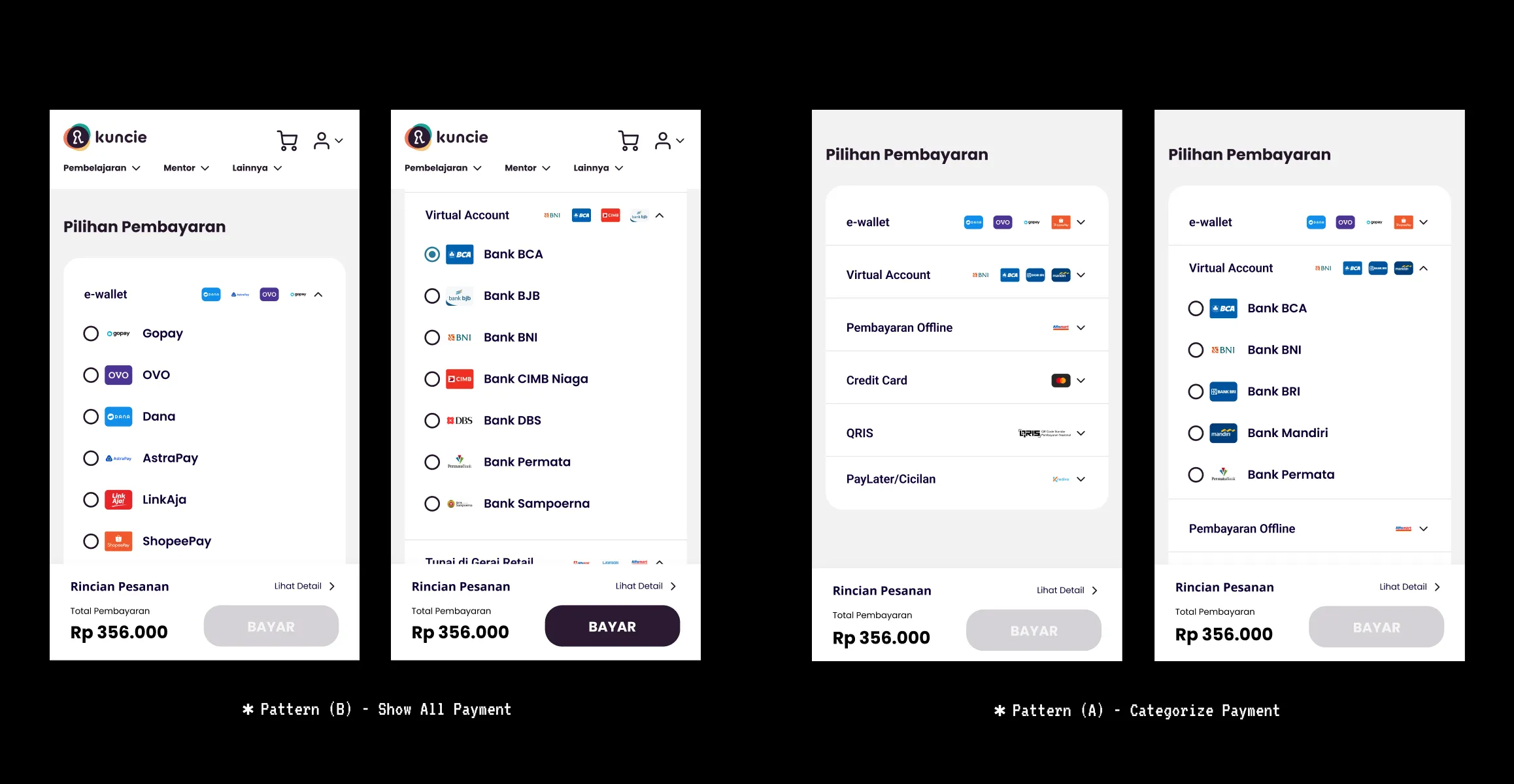
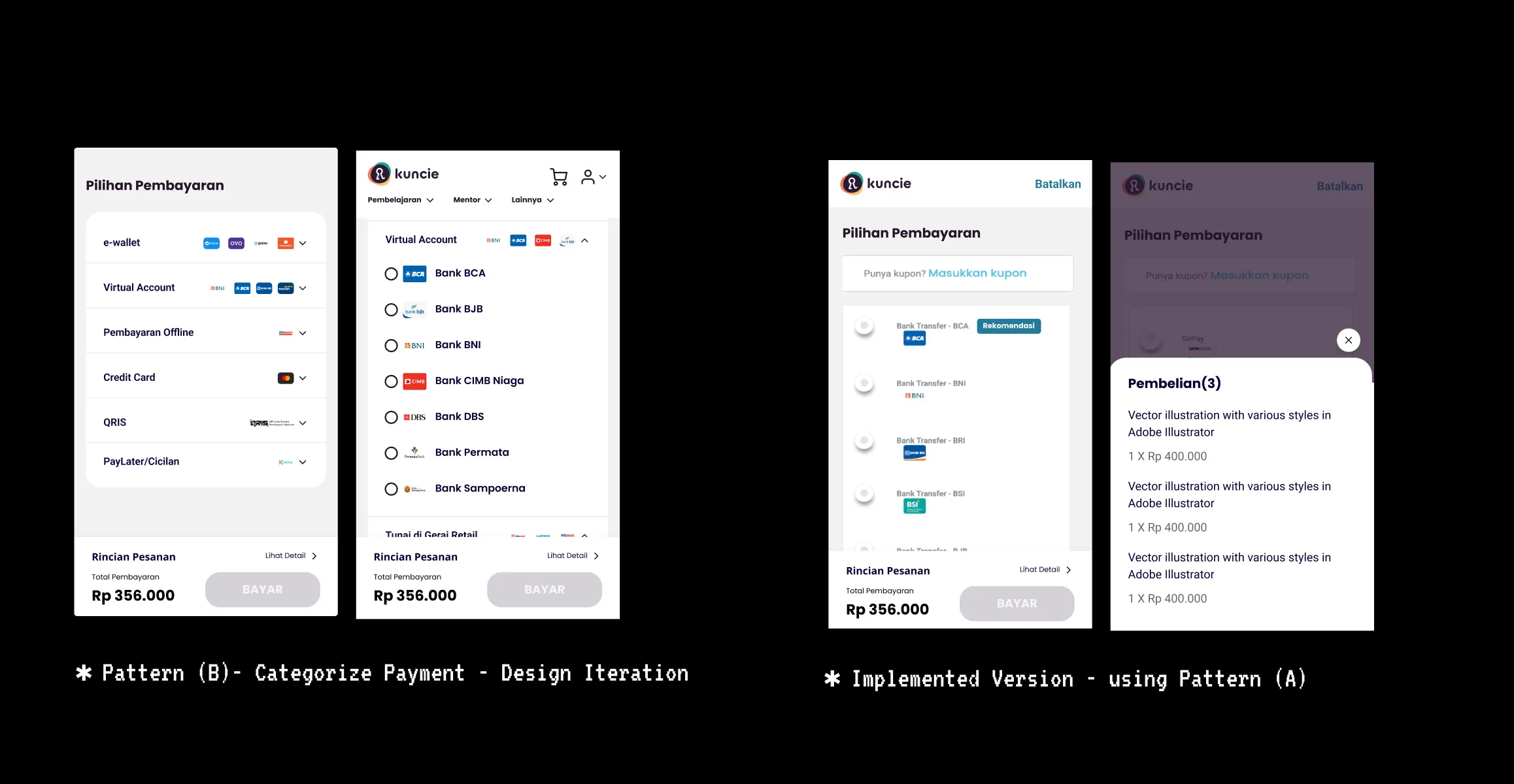
We know that there will be 15 or more payment methods that are available to use on our website, so we took the Pattern (B) approach to overhaul our payment method interface but some stakeholders believe that Pattern (A) is gonna work better on the interface so we prepare both iterations and will test it later on.
Mini AB Testing
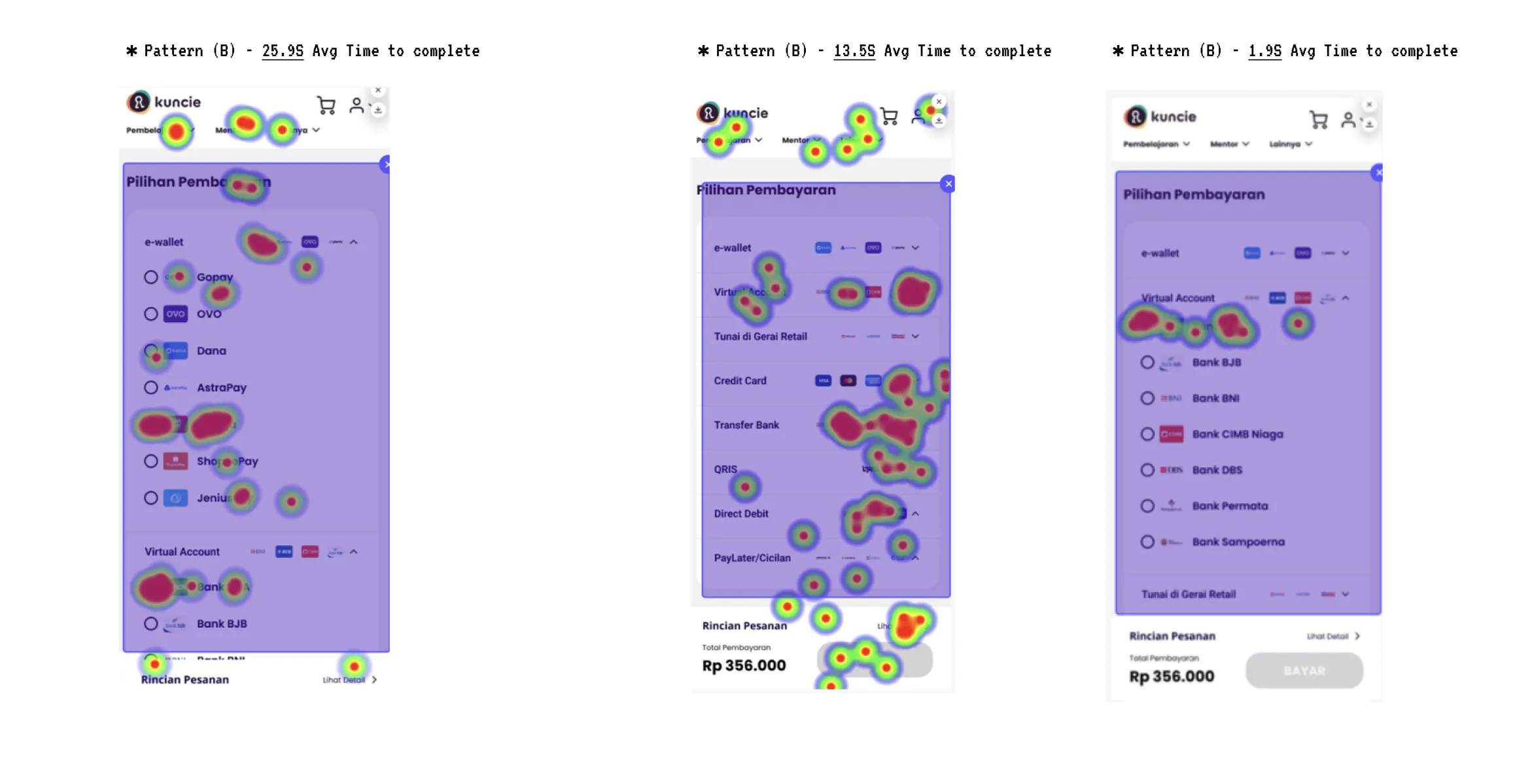
We have Pattern (A) and Pattern (B) iterations to test out, we conduct the study unmoderated using a total of 20 participants, 10 Participants gonna be tested with Pattern (A) and the other 10 will be tested with Pattern (B)
Reporting our findings
We've concluded our mini A/B Testing and now need to understand how both patterns affected user interface usage. Pattern (A) was found to take more time to complete, suggesting that the "show all" interface may overwhelm users with options, leading to longer decision-making times. On the other hand, Pattern (B) was observed to require less time to complete, indicating that its fewer choices could make it a more effective option for implementation in the next iteration, aligning with the principle of minimizing cognitive load to maximize usability (NNGroup, 2013).
The Implementation
Despite encountering challenges such as a lack of manpower and technical issues preventing the execution of Pattern (B) on the WordPress environment, we made adjustments to the current design to address these issues. Unfortunately, we identified this problem late in the development process. However, let's celebrate this as an alternate success story. In the implemented version, the payment methods were reduced to 8 options, and the pay button is now sticky, aiming to make the user experience easier for everyone.
re Approaching the Brief
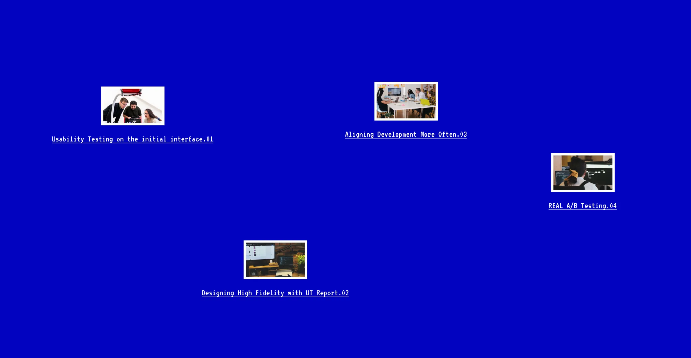
With more resources and time, we would approach the project differently. We would start with usability testing on the initial interface to uncover more issues and gain a better understanding of how users react and feel while using it. This would allow us to understand the problem space better and make informed design decisions. Next, we would design high fidelity with usability testing report, ensuring that our design resonates more with users. We would also align development more often to avoid late changes in development. Finally, we would conduct real A/B testing for the two pattern alternatives, using a bigger sample and longer time durations to make more valid and clear design decisions.
Available for Q1 2025
(c) interinyourface 2025